Showing posts with label masculine. Show all posts

Wednesday, September 7, 2011

More Makings of a Summer

Hi All!!

I almost forgot that I haven't shared more of the scrapbook pages I made for the young man that stayed with us for the summer while he played in the collegiate wood bat baseball league.   Sorry about that.....

Here are some more layouts -


Take a closer look at the ribbon thingy -


More fun -


I had so much fun putting this scrapbook together - hope you are enjoying the eye candy......  I still have more pages to share.....later ;)

Have a great day -

Tuesday, August 16, 2011

WOW! It has been a while........

I can't believe how long it has been since I was able to stamp something that I can share - and boy have I missed it!!!  If you know me personally - you know that we hosted a baseball player for the summer from Colorado so we have been engulfed in his games  -it has been a really fun summer - busy, but fun!!  Well, he turns 21 on Sunday so I needed to whip him out a card to mail with his birthday gift.  I have some serious stamper's block going on - awful!  I have been stamping all summer, I made him a scrapbook of his season/summer here but not much cards unless it was for a class or club.  So - you know I had to turn to a challenge........What better challenge that the Create with Connie and Mary challenge - this week was a sketch challenge. Wanna see????


Kind of feminine, I think....but I think I manned it up  - wanna see what I did?


I know - I took some creative liberties here.  I flipped the sketch.......took the three elements that would be at the top of the flipped sketch and put it at the bottom - one element instead of three.......please don't beat me.....pretty please.......

I am on a time crunch here- but I will tell you I am LOVIN' the new designer series paper, Well Worn.  And the sentiment came from the hostess set, many birthday wishes. I adhered it to the new denim ribbon with a safety pin from trinkets.  Oh Yeah - the denim ribbon.......I bet you are all thinking that it will be stiff....like blue jeans - it isn't.......so pliable.  I am really liking it too.  shocker, uh?  LOL

Here is a closer look at the main image - the scallop circle is cut from the new pennant die.....a MUST have!  I also inked the chipboard numbers with the not quite navy craft ink spot. 


Everything on the card was roughed up and dirtied up - what do you think?  Make sure to keep checking back - I am going to share his entire scrapbook with all of you.  minus the sappy journaling at the end - LOL

Thursday, June 2, 2011

I'm sailing away.......

Set an open course for the Virgin Sea.
'Cause I've got to be free......
Free to face the life that's ahead of me.

That has to be one of my ALL time favorite Styx songs - ever!  If you are familiar with it -keep humming away as you read along.  :)

I have a little goodnesss to share with you today......and it all began with a sketch.  I know - shocked, right?  Me starting with a sketch or color challenge.....I can't help myself....that is what inspires me.  you should try it out sometime......hehe

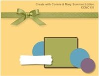
Anyway - back to my little creation for the day.  The sketch originated with the Create with Connie and Mary Summer Edition.  They offer up the best challenges.  Head over and check it out.  Here is the sketch:


Now I know you are probably wondering what stamp set I used for this little baby.....When I saw the sketch - I IMMEDIATELY thought to use Open Sea......but all of you are probably tired of my obsession with the nautical stuff.....so I sat on the sketch for a few days and couldn't get my mind to bend from my original vision.....so I stopped fighting it and went for it.  What do you think?


I adore "dirty" cards.  do you?  The stamps are all from Open Sea except the sentiment with is from All Holidays, which is on the retirement list.....WHAT???  I love this set - it covers just about All Holidays.....get it?  i couldn't help myself......   I just can't believe it is retiring :(  The designer series paper is from the mini catalog as well - Nautical Expedition and the baker's twine....oh how I love the baker's twine........  wanna take a closer look at the ship?  If you don't, turn your head because I am about to show you:


And I just couldn't resist the inside:


Well- that about sums it up for the day - let me know what you think - i {{luv}} comment love.....lol!!

Sunday, May 22, 2011

grunge rock, baby

Well.....wouldn't you know????? 

I was working on a card for the Create with Connie and Mary challenge this week - a sketch challenge......and I also won a subscription to the Create with Connie and Mary Summer Edition - GREAT ideas on there....by the way  :).......and they host a challenge for all subscribers on Saturdays....it was a color challenge.  KNOW WHAT????  The colors I was working with were the same exact colors that were in the Summer Edition challenge!!!!  It was meant to be.....inky fate, so to say ;) 

Wanna see both challenges??


Sweet on both, huh?  I bet you are wondering where I went with those......Well - even if you aren't - I will still show you - lol!!!


One thing to note - the color challenge said we could add any neutrals - I added crumb cake and basic black.  I challenged myself not to use whisper white or very vanilla.....how did I do?  The card base is basic grey - I think it looks a little bluish here - but trust me, it is grey....hehe

I did take the creative liberty of enlarging the main image panel of the sketch - please don't stone me for it.....I really wanted to use a combination of Extreme Elements and Grunge Rock - which is on sale this month.  I think Grunge Rock is essential if you make teen cards - or if you make any cards for people that are in video game rock bands ;)  And at the sale price - who could resist????

Take a closer look at the dirtiness of those panels and all of the layering of stamps.


I would love to know what you think of my grunge rock, baby.
Have a great day!

Wednesday, April 13, 2011

Come Sail Away.......

come sail away......come sail away with me......  Any Styx fans out there singing along with me?????

Oh Boy Oh Boy - Stampin' Up! has really out done themselves with the nautical collection in the new Summer Mini that starts May1st - I don't live on the ocean or even own as much as a row boat.....but I am really drawn to nautical stuff.  This is THE collection to own for go to stamps for men, that's for sure.  I started with the Mojo Monday sketch - no shock huh?  I am so addicted to sketches.......  {{sigh}}

Here is the sketch goodness:

Looks great like it is, huh????  Well - I rotated it to fit my needs :)  Wanna see what I did with it???

Okay - here is my sailing goodness:

Do you see the new goodies???  The designer series paper - Nautical Expedition, The stamp set - The Open Sea, punch - Postage Stamp Punch, and finally......Cherry Cobbler/ White baker's Twine - Hello!!!  These are some drop dead gorgeous things!!! 

I also used a game spinner hand on my compass.....{luv} it :)
take a closer look at the water colored sail boat and compass:

The ship and compass were stamped onto watercolor paper and water colored with my aquapainter and ink refills....ba da bup ba da.....i'm lovin' it!!!!  ;)

What do you think of The Open Sea?  I am totally smitten with the new collection......makes me yearn to see what the New Idea Book and Catalog will have in store for us.......  {{sigh}}

Monday, June 14, 2010

Camping by Starlight

Can you believe I have had Loads of Fun since it came out over a year ago.....and I haven't inked it up until today?!?!?!?!?  I absolutley loved the camper image.  I thought it would make perfect cards for my Dad, he has a beautiful motor home and like to camp when he gets a chance.  So, I took today's mojo moday sketch to make him a father's day card.  Here is the sketch:

Looks like a great sketch, huh?  I'm sure I will come back to this one again and again.
Wanna see what I did with it??

First....I want to say I am sorry about the yellowish picture......I couldn't get it right today, for some reason.

I did add two elements on the bottom left hand corner - I hope I am not banned for life for that!  lol!!  They are a modern label punch cut in half accented with silver brads
The card base is bashful blue. The designer series paper is from Travel Journal.  I absolutely love that map image!!  It is matted with night of navy.  The sentiment is from teeny tiny wishes.  I stamped it with garden green ink and adhered it down like a banner.  The elements on the left hand side are strips of night of navy card stock accented with silver brads.
The main image is from Loads of Love.  I stamped it with black staz on ink onto watercolor paper.  I colored, with a blender pen,  the camper image with classic reinkers: bashful blue, night of navy, marina mist, so saffron, basic grey and silver shimmer paint.  I then placed a mask of the camper over it and spongeds the night sky with night of navy and the ground with garden green.  The stars in the sky were added with a white gel pen.  I then matted it with a torn layer of bashful blue and a layer of night of navy.

Did you really think I forgot about the inside???

Now, really....did you think I forgot???

Well....how did I do?

Wednesday, June 2, 2010

I'm back........

I hope you missed me as much I missed all of you!  I can't believe how long it has been since I blogged any eye candy for you!!  I am so sorry.....  The month of May was very busy for our family - my little one was busy with her end of preschool activities, dance lessons and soccer two nights a week.....put that on top of us getting ready for an 8 day vacation in Walt Disney World and the usual day to day life around here....needless to say, I didn't get very much creative time....booohooo!!!

Well....the perfect excuse to get into my groove last night was a thany you card for our travel aent.  She did our online check ins for our flight when we were away since we would not have internet access at that time.  I really appreciated her doing that fo rus on top of all the help she was to us before we left with questions and requests. ( I am a pretty thorough traveler...lol!)  So I just had to pul out Sentimental Journey!!

Well??  you like??  I like the finished product.  (nothing like patting myself on the back, huh?  hehe!!)  The base is kraft (soon to be crumb cake)  I stamped a background with sahara sand ink with the word "journey" and the suitcase.  The dsp is travel journal.  The rest is pretty self explanitory, I think.  The blue is night of navy and the orange is pumpkin pie.

I would really like to know what you think - I could use some "welcome back" love ;)

Tuesday, January 26, 2010

HB2U

HB2U, HB dear blah blah blah, HB2U!!

Here is a card I made using pleats to make it a little bit more masculine than a ruffle.  lol!!


The card base is soft suede.  I stamped the balloon from crazy for cupcakes in soft suede classic ink.  The patterened paper is from Thoroughly Modern....I just love that pack of designer series paper!!!  I wrapped a piece of soft suede polka dot grosgrain ribbon around it and tied a simple knot.  The ticket image is from the level 2 hostess set, Admit It.  The pleats are in whisper white.

Here is a close look at the fun pleats:


Well.....how did I do??   I think this would pass as masculine, wouldn't it?


Wednesday, January 13, 2010

It's raining MEN....

hehehe! No - thank you. lol!

Today I whipped up a masculine birthday card. I struggle with masculine....I always want to add "fluff stuff" - glitter...bows....do dads....fluff...and stuff....

But, today I came up with a simple, clean lined ,masculine card that uses specialty designer series paper, To The Nines, so it has texture to touch and see with out it over powering the clean lines of it. Am I rambling here??? lol!


Ok, enough of me....


I have to say, I am pretty pleased with it. I don't usually do clean lined, quick cards. But, this, I like.

Friday, July 31, 2009

A fine day to be a pheasant

HI all!

Today is Blogger's Challenge day and it is a sketch challenge.

Here is what I came up with...I haven't stamped in two weeks, really - so my mojo is definitely not flowing.....I think we are back to semi-normal now so maybe I can get myself back in the swing of things :)

One thing I did change about the sketch was the sentiment placement. It was supposed to be on the lower panel, but I put it under the pheasant instead.

recipe:
stamps: woodgrain background, autumn days, teeny tiny sentiments
cards tock: kraft, very vanilla, soft suede, bermuda bay
ink: soft suede, bermuda bay, chocolate chip and bravo burgundy stampin' write markers
accessories: 5/8" vanilla grosgrain, latte buttons, playground buttons, stampin' dimensionals

I sure could use some love this week.....let me know what you think.

Friday, June 19, 2009

Father's Day is upon us!

It is hard to believe that Father's Day is this weekend...before you know it it will be 4th of July - and that feels like summer is half over. unbelievable! Our little one goes to preschool this fall....so this feels like our "last summer"....know what I mean??? from now on, it will be a short summer in between school years. Wow!!! Where has the time gone?

Well, before I get to deep on you......I will show you my Dad's Father's Day card. He isn't into computers at all...let alone a blog reader....so I am safe here ;)

This week's Blogger's challenge is masculine cards - perfect!

I wanted to pull out some F.A.V.O.R.I.T.E. retiring goods! I will miss baja breeze so much it will hurt....and the seaside stamp set - I am still in shock that is retiring!!! I have got a peek in the new cattie....if you are wanting a sea shell, beachy beautiful set - GET THIS ONE!!!!! There is nothing that will replace it in the new catalog......booohooo.......


The card base is creamy caramel. I swiped all edges of this card with a sponge dauber and whisper white craft ink. All of my baja breeze designer series paper wasn't doing anything for me to use for my Dad's card. So, I made my own printed paper! I took three sea shell stamps and stamped them randomly in baja breeze, not quite navy and creamy caramel onto the three baja breeze panels. They are mounted on whisper white card stock and then anchored in all corners with not quite navy brads from the earth elements brad collection. I used my mat pack and piercer to ensure that they would all line up perfectly. I then adhered the panels down with stampin' dimensionals.

My sentiment panel is stamped in baja breeze and not quite navy. It is from wonderful favorites, a must have stamp set for all family cards....it covers ALL relationships. I then stamped creamy caramel around the edges with itty bitty backgrounds to kind of simulate sand...did I do that? That is mounted onto creamy caramel and then not quite navy. It was adhered with stampin' dimensionals.
The sea shells were watercolored with the reinker watercolor technique. The three ink colors I used were baja breeze, creamy caramel, and not quite navy. The one bottom shell looks a little coral-ish...but it was how creamy caramel dried with the baja breeze....that is the beauty of this technique...it always turns out differently, and beautiful if I might add. Those were also adhered with stampin dimensionals.

This card has so much dimension...i {luv} dimension!!!
What do you think of this....I am so pleased with it - I hope my Dad likes it.

Make sure you stop by tomorrow....I have a scrappin' Saturday page for you that is a sneeky peaky.....

Thursday, June 18, 2009

I am falling in love......

....with the new in colors. I will so much miss the ones this year...I love each and every one of them also!!! Here is what is coming up on July 1st:


As a demonstrator, we are able to preorder a handful of stamp sets and accessories out of the upcoming catalog. If you are interested in being a demonstrator, I would love for you to be part of my team...be sure to contact me ( regcorn@zoominternet.net )

I ordered almost everything we were able to order....hehehehehe!!! I set I was immediately drawn to was autumn days. I got to play with it a little bit today! whooohoooo!!!!


The card base is really rust, it is stamped with a small maple leaf stamp that is part of autumn days. Every stamp of the card is from autumn days except the sentiment. The brown panel is a new in color - soft suede....love it!!! The yellowish panel is crushed curry. I embossed the wheat in clear embossing powder and then sponged all over it with crushed curry and soft suede on the edges. Both of those panels are distressed with the tool kit.

Oh, did you happen to see the sentiment? It is from teeny tiny wishes...a new, large set of sentiments that are all in a small font - punch friendly - LOVE THAT!!!!! Oh a new punch???? Oh yes.....that is the new modern label punch. I accented it with a few vintage brads.


The pheasant was inked with a combination of ink pad and stampin write markers. I will "own" this pheasant with more practice....I don't quite "own" it yet, in my opinion...but I will, soon! I want him to look realistic.....i will get there. :)

Anyway, check out the dimension that the distressing and dimensionals give.
What do you think? It is my first stab at this new set....I hope I did it justice :o)


Wednesday, May 27, 2009

A tool belt - Stampin' Up! Style!!!

HI stampers!!

Did you have a wonderful Memorial Day weekend?? We sure did....lots of family time! I am still recovering from staying up until 11 all weekend. lol!!! I am not a night person, obviously!!! I am not really a morning person either....oh my!

I have had this idea in my head for a while now. I need a few Father's Day cards and I knew I wanted to make this into one.

What do you think????

The base is bordering blue. I swiped my whisper white craft ink pad over it and then went over that with the bordering blue classic ink pad. The shirt is more mustard. I made stitch accents with my white gel pen before sponging the edges so I could tone it down a little. When my Dad does any kind of work, he uses red work rags. That is where I got the idea for the red rag in the pocket. His usually hangs out his pants or shorts pocket....but the shirt needed some color pop. lol! Here is a closer glimpse at the shirt:

For the pants, I drew in the zipper pouch and a leg seam with my basic black stampin' write marker.

Now for the fun part!!! The tool belt!

It is made from scraps of card stock left over from my wallet project. I made an actual pocket to put tools in and then punched the top sides with the horizontal slot punch to create a place to run my "belt"...aka 5/8 inch chocolate chip grosgrain ribbon. :o) The tools, from totally tool, were stamped onto water color paper and then colored with ink refills and a blender pen. I wanted the silver part of the tools to have a bit of sheen...with out using glitter - I know....How could I turn my back on glitter????....so, I used a little bit of Encore silver ink refills. It looks really neat in person...I don't know how well you can see it in the picture. Don't you just love the little loop for the hammer??? I thought it was cute. :) Here is a closer look at the tools:

Now, tell me...what do you think? This card could be so many things....a masculine birthday card, a card for any occasion for a contractor relative or even a thank you card for someone who has done contractor work for you at your home or business. But for me, this will fill in for Father's Day!

Thursday, May 21, 2009

A Wallet for Father's Day

HI All! I am so sorry I haven't posted much lately.....I can't get my act together!!! I have been scrapping...I will have to get that photographed and posted for you - hopefully I will provide you with some scrappin' mojo. :)

I made this wallet last night for Father's Day. I haven't decided who will get this....my hubby, my dad, my step father.....who knows!?!!? Depends on what my final gift will be for them. :) i modeled it after my husbands wallet....I love the flap out part. I will put a picture of my little one in there maybe or a gift card. And of course, there is a money slot....gotta have a place to put your money!! I did leave the inside solid card stock so I could easily write on it.


Here is the front:
look at all that faux stitching.....that was fun!!!


Here it is open the first time:

Here it is open all of the way....see the place for the picture? So darling!! It actually opens from the fold to slip a picture up in it....just like a real wallet :)
Here is a closer look at the texture.


Can you see it in the picture? It feels like brushed leather, suede, or even a felt type of fabric. And the entire wallet is made from close to cocoa card stock...cool, huh? I like it. I used the white gel pen for the stitching after piercing it with the mat pack and piercer. That is the only way I can keep my holes lined up - what a great tool!!! The Happy Father's Day sentiment is from All Holidays.


Wanna know how I did the texture????


Do ya????


I can't hear you..........


OK.....OK.......


I took a piece of close to cocoa card stock and rubbed it against the edge of my desk in all different ways to break down the fibers in the card stock. I carefully peeled a corner apart and started to pull it apart. I then adhered it to the clse to cocoa card stock that actually made up the wallet. The card stock pulled apart is too thin to use on it's own for a project like this.


Would you have guessed that??

What do you think????

Saturday, April 18, 2009

Monday and Friday's challenges on Saturday???

HI stampers!! It felt sooooo good to get into my studio this afternoon. Hubby came home from work, mowed the grass and he and the little one are outside for play time so mommy can have some playtime!!! Truth be told, I was actually "working....." I have two water color workshops coming up this week...and I had to watercolor, right????? HEY! That is my story and I am sticking to it!!!!

So, when my water coloring was done for class I figured....hey, why not get caught up on some things that I needed, well....wanted, to do for this past week. My hubby's birthday is next Friday and I wanted to crank him out a card. Sure, I have masculine samples in my box....tons of regular birthday samples......I could have taken one of those out.....but what would I have stamped today???? I have more excuses to stamp than anyone I know.

Truth is, I need to create. It makes me feel so good. Creating is something that is all mine. Not to sound like a selfish brat....but I kind of lost "myself" when I quit my job to stay at home to raise our little one. I am not complaining at all.....I would not want it any other way...and I know that there are many moms that would love to be in my position....but I still need "my thing." You know?

Anyway....I am rather chatty today. huh? Sorry...it is probably the morning filled with Handy Manny and singing along to an Alvin and the Chipmunk sing along movie with my little one. I keep telling myself to slow down and enjoy her.....before I know it she will be singing songs with her friends all holed up in their bedrooms practicing their make up applying skills and giggling about boys. Oh my...just to type that out makes me well up.....

Oh...off track again, huh? LOL!!!!

Anyway....I made a card today to combine two challenges. Monday's mojo challenge and Friday's blogger challenge.

When I sat down to stamp....this card wasn't what I had envisioned at all. I wanted to use two of the FREE stamps that Stampin' Up is giving away this month with the Get Connected Campaign, and I only ended up using one....texturz plates were flyin', brayers were a rollin', and accessories were jumpin' around.....

Here is the mojo monday challenge:

Blogger's challenge was a color challenge this week. We were to use sahara sand, always artichoke, chocolate chip, and sage shadow. Now, mind you I would have never put these colors together myself. The chocolate, sahara and one of the greens...yes, but not two.... Now I want all of you to turn to page 158 in your Stampin' bible.....Yes, that is your current Idea Book and Catalog. See the colors of the To the Nines Specialty designer series paper?????? Exactly what we were to use. Genius!!! I have been telling my club ladies to turn to these designer series color schemes. I get so many compliments on the colors I put together....and you know what??? I don't put them together...I let Stampin' Up do all of the work....that is what I LOVE about our catties. They are so much more than a place that merchandise is for sale from.....I use mine for alot of inspiration.

Ready to finally see the card??????

The base is sahara sand. The background panel is always artichoke ran through the big shot with stampin' up's exclusive texturz plates. LOVE that...but I wanted to add more to it....so I took out my brayer and went to town with chocolate chip ink. me like :) I tore the bottom edge instead of scalloping...doubt my hubby wanted scallops..... And then layered it with a mat of chocolate chip. Did you see my ribbon treatment??? It is the double stitched chocolate chip ribbon.....I pulled out the white stitches....luv it! And then my corduroy buttons.....did you see 'em???? Double stacked!!! Oh my!!!! Kraft on chip.....how darling!!! I mean, masculine!!!! The kraft buttons go very well with sahara sand as well as kraft. That is double dippin' in my eyes as far as accessories go!

My sentiment, birthday wish on page 208, was double stamped with always artichoke and sage shadow. I really love sage shadow, but I really thought that one main green was enough...I left sage to be a supporting green....lol! Maybe they are up for emmy awards.....main character and supporting character....Oh my....I need caffeine! The brads in the main image panel is from vintage brads. I used my matt pack and piercer to place the holes for them. That panel is mounted up on stampin' dimensionals.
What do you think? Think my hubby will like it? I will tell him that he should feel good about getting two of my corduroy buttons......I mean there are two of them, people?!?!?!??!?!