Saturday, June 20, 2009

Scrappin' with new goodies!!!

Oh yummmmm........that is all I can say about the raspberry lemonade designer series paper!!!

I was able to get this page done while my hubby was bathing our little one. He is so good to me like that, mostly! ;)


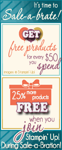
The background page is a new in color - crushed curry. The designer series paper is raspberry lemonade, of course {wink}. The pink layer is actually regal rose. I stamped on the bottom of the page with a flower from a new level 2 hostess stamp set, kind and caring thoughts. Wait until you see the new hostess sets....they are awesome!! My journaling block is crushed curry and the journaling is done with my rich razzleberry stampin write marker - OH YEAH - there are new in color markers!!!!! Thank You Stampin' Up!!!!


Did you see that adorable coffee cup?? Well, actually it is hot chocolate here.... :) A while back, I was strolling along in a grocery store and a representative was handing out coupons for maxwell house coffee - they were inside the coffee cup shaped folder! I about jumped for joy to get that folder!!! I hate coffee but my hubby drinks it, so the coupons did not go to waste, but that cup template was mine....all mine!!!! I traced it onto a new in color rich razzleberry and then stamped it with a viney type flower from the same hostess set. I did stamp the cup with a retired sale a bration set, yummy, in whisper white craft ink and embossed it with clear embossing powder. And the steam....don't you love it??? I stamped the flourish from baroque motifs onto window sheets with white staz on ink. When stampig the window sheets with white, it is important to use the white staz on - it will dry a lot better for you.

See the little ribbon detail?? The top piece is a piece of double stitched rose red layered with the new polka dot crushed curry grosgrain ribbon. See the rich razzleberry piece under it??? The ribbon is only polka dotted on one side so you have the option of dots or no dots - genius!!! I love how Stampin' Up is really paying attention to detail with the new accessories.
leave me a little word about how you like this page....and the new in color stuff. I am really excited about them!!

Friday, June 19, 2009

Father's Day is upon us!

It is hard to believe that Father's Day is this weekend...before you know it it will be 4th of July - and that feels like summer is half over. unbelievable! Our little one goes to preschool this fall....so this feels like our "last summer"....know what I mean??? from now on, it will be a short summer in between school years. Wow!!! Where has the time gone?

Well, before I get to deep on you......I will show you my Dad's Father's Day card. He isn't into computers at all...let alone a blog reader....so I am safe here ;)

This week's Blogger's challenge is masculine cards - perfect!

I wanted to pull out some F.A.V.O.R.I.T.E. retiring goods! I will miss baja breeze so much it will hurt....and the seaside stamp set - I am still in shock that is retiring!!! I have got a peek in the new cattie....if you are wanting a sea shell, beachy beautiful set - GET THIS ONE!!!!! There is nothing that will replace it in the new catalog......booohooo.......


The card base is creamy caramel. I swiped all edges of this card with a sponge dauber and whisper white craft ink. All of my baja breeze designer series paper wasn't doing anything for me to use for my Dad's card. So, I made my own printed paper! I took three sea shell stamps and stamped them randomly in baja breeze, not quite navy and creamy caramel onto the three baja breeze panels. They are mounted on whisper white card stock and then anchored in all corners with not quite navy brads from the earth elements brad collection. I used my mat pack and piercer to ensure that they would all line up perfectly. I then adhered the panels down with stampin' dimensionals.

My sentiment panel is stamped in baja breeze and not quite navy. It is from wonderful favorites, a must have stamp set for all family cards....it covers ALL relationships. I then stamped creamy caramel around the edges with itty bitty backgrounds to kind of simulate sand...did I do that? That is mounted onto creamy caramel and then not quite navy. It was adhered with stampin' dimensionals.
The sea shells were watercolored with the reinker watercolor technique. The three ink colors I used were baja breeze, creamy caramel, and not quite navy. The one bottom shell looks a little coral-ish...but it was how creamy caramel dried with the baja breeze....that is the beauty of this technique...it always turns out differently, and beautiful if I might add. Those were also adhered with stampin dimensionals.

This card has so much dimension...i {luv} dimension!!!
What do you think of this....I am so pleased with it - I hope my Dad likes it.

Make sure you stop by tomorrow....I have a scrappin' Saturday page for you that is a sneeky peaky.....

Thursday, June 18, 2009

I am falling in love......

....with the new in colors. I will so much miss the ones this year...I love each and every one of them also!!! Here is what is coming up on July 1st:


As a demonstrator, we are able to preorder a handful of stamp sets and accessories out of the upcoming catalog. If you are interested in being a demonstrator, I would love for you to be part of my team...be sure to contact me ( regcorn@zoominternet.net )

I ordered almost everything we were able to order....hehehehehe!!! I set I was immediately drawn to was autumn days. I got to play with it a little bit today! whooohoooo!!!!


The card base is really rust, it is stamped with a small maple leaf stamp that is part of autumn days. Every stamp of the card is from autumn days except the sentiment. The brown panel is a new in color - soft suede....love it!!! The yellowish panel is crushed curry. I embossed the wheat in clear embossing powder and then sponged all over it with crushed curry and soft suede on the edges. Both of those panels are distressed with the tool kit.

Oh, did you happen to see the sentiment? It is from teeny tiny wishes...a new, large set of sentiments that are all in a small font - punch friendly - LOVE THAT!!!!! Oh a new punch???? Oh yes.....that is the new modern label punch. I accented it with a few vintage brads.


The pheasant was inked with a combination of ink pad and stampin write markers. I will "own" this pheasant with more practice....I don't quite "own" it yet, in my opinion...but I will, soon! I want him to look realistic.....i will get there. :)

Anyway, check out the dimension that the distressing and dimensionals give.
What do you think? It is my first stab at this new set....I hope I did it justice :o)


Saturday, June 13, 2009

Scrappin' Saturday is back, Baby!!

This morning, I went into my craft room because my little one wanted to "cut." And I thought....Well, I have been working on getting my desk in order...I will sit there and do that while she goes to town with decorative scissors and old card stock. Wouldn't you know it....my pictures files were sitting there, all innocent, and the pictures on top were her glitter art pictures. I usually only do 2 page spreads...I like the look in my albums much better than one pagers....so I had been struggling with what to do with these pictures. So I picked up my stack and the next set of pictures were also better appropriate with a one page spread. It was meant to be....make 2 one page spreads...they will still be in chronological order (which I am a nut about) and I won't drive myself crazy anymore.....

So, here is the fruit of my morning labor.....


Now, mind you, this is about glitter art...so I had to include some glitter, right???? See the little orange glitter edge of my "focal point" photo....
It is hard to see in these pictures, but the chipboard letters are glittered up with chocolate chip glitter....yummo.....

And do you see the paper at the bottom of the page? Are you wondering when Stampin' Up started to make glittered papers??? Well, they don't..... You know you could go into a scrapbook store and spend a couple of dollars on a preglittered page???? But using the supplies you already have....you can make your own for PENNIES!!!! I took the striped designer series paper and used a 2 way glue pen do draw in lines, I did use a ruler (well, actually it was a popcicle stick - i couldn't find the ruler.....) to keep the lines straight. I drew in a couple of lines and blinged them up with dazzling diamonds. I only did a couple at a time, I wanted my glue to be nice and wet when I glittered it up. Wanna see that up close???


Did you see the jumbo grommet?? I love those.... :D

card stamps: define your life
stock: regal rose, pink pirouette, chocolate chip, pumpkin pie, whisper white, sweet always designer series paper
ink: versamark, regal rose
accessories: scallop edge punch, jumbo grommet, lots of letters chipboard alphabet, 2 way glue pen, dazzling diamonds, stampin' up fine glitters

Tuesday, June 9, 2009

The purity of white.......

HI stampers!!

I have to say...I have been talking about executing this card ever since I bought this folder ( the first order from the current cattie) and guess what???? Today's challenge is to do a one layer, white card. Any inks could be used....but only one layer for the card and it had to be white. P.E.R.F.E.C.T.!!!

It is really a lot prettier in real life...it is so hard to catch the shimmer on camera. argh! :(

I embossed the card front, shimmery white card stock, with the manhattan flower impressions folder....love that! Folded in half. Tied a bow with the white satin ribbon from the Occasions mini catalog. If you don't have any of that...you gotta get your self some - it is so smooth.....yummo.......

I made the hang tag using the faux metal technique on white card stock, so I don't believe I broke any rules..... :D It says "Mr & Mrs." and is from all holidays.


What do you think?

Don't check out on me just yet.....

The Dream Builder team I belong to is having a blog tour...beginning July 1st with the release of the new catalog....Keep checking in here for more details. You will not want to miss this tour - and you don't even need a passport! lol!!

Monday, June 8, 2009

Lookin' for my mojo......

....anybody seen it???? I have missed crankin out stamped goods....it just seems like life has me by the horns, you know what I mean??? Well, I was determined to create this morning and since it is Monday...I thought it was perfect to start with the mojo monday sketch challenge.

Catalog transitions are so hard for me.....I know I am going to miss the current designer series papers and in colors that I want to hoard them....I feel that I should not use them at all...lol! But yet, my new stuff hasn't even shipped yet from last Monday....so new designer series paper and in colors aren't an option. Oh, I know there are 48 other colors to work with - it's my party, and I'll cry if I want to! hehehe!!!

Anyway.....here is my card for the day:

I had so many ideas for the area where the flower is....and I thought....you know..Urban Oasis has the coolest papers in them...the flowers can stand on their own just by cutting them out. So that is what I did :o)

My card base is whisper white, I don't do that often, but I wanted a "clean," "tailored," & "crisp" look today. All of the designer series paper is urban oasis, including the flower cut outs. My sentiment is from on your birthday. The mats are not quite navy....did I ever mention that my very first ink pad and paper was not quite navy???? there is some trivia for you...lol!

And the kiwi kiss ribbon???? Well....I sure will miss that...as a matter of fact I have a couple of rolls on the way to hoard....lol!!! The brads are from the earth elements brads collection.

I decided to spruce up the inside a bit....wanna see?

What do you think? Let me know, I have big shoulders, I can take it! hehehe!!

Thursday, June 4, 2009

Want a sneaky peeky????

Hi all!
I haven't had the time to stamp yet this week....ARGH!!!!!! I need to slow down and get with my stuff!

Anyway...I did place a preorder for some goodies that are coming in the new catalog on July 1st.....I can not wait until it gets here!!!! I didn't expedite shipping....so I will probably have towait 2 weeks, the shipping is so behind with the preorders.....WHY, OH WHY didn't I expedite????

Well....anyway I do have a picture of the new in color ribbons - Thanks Jan!

Wanna see them???


no???


Ok, never mind.


LOL!!!!!!


Here they are!!! And they are looking goregous!!!!!!
I am in love.........

Monday, June 1, 2009

Last Chance to get these items!!!!

Click HERE to view the alphabetical list of retiring stamp sets

Click HERE to view list by page number

DECOR ELEMENTS last chance list

Here is the list of retiring accessories - SOME ON SALE and WHILE SUPPLIES LAST

Be sure to contact me right away before what you love is gone forever!!